RAW, JPEG, SOOC or something in between…
First things first. This is not yet another post on the merits of JPEG over RAW - or vice versa. I think we’ve all had enough of them. Rather, I’d like to develop (no pun intended) some more thoughts following my last post on the merits of taking images straight out of camera (SOOC), or processing them afterwards in Lightroom or a similar photo-editing software platform.
One of the advantages that I see Fujifilm cameras having over say the likes of Sony, Nikon, Canon etc (Leica even!) is that they have made it possible to tweak at the camera settings level, how a JPEG image looks like when the image is taken. Colours, tones, highlights, clarity etc are all adjustable. Given Fuji’s legacy as a film manufacturer, it’s not a head-scratcher to wonder why they have made their cameras in this way.

This tweaking of settings as to how a JPEG can, within a digital context, appear like an image produced from a film camera, has allowed many people to generate their own “recipes” or settings. Ritchie Roesch being arguably the most prolific generator of such recipes although Kevin Mullins also has a number that he shares.
All with the intention of not having to spend considerable time in front of a computer screen moving sliders around in Lightroom to generate the same look. Just take the photo - and bam. You have it to share straight away.
One of the reasons I chose Fujifilm cameras back in 2019 when I started to re-engage with photography again. (I’ve written about this journey in my short bio).
Except….
I rarely share straight out of camera images.
More often that not - like 98% of the time - I edit the RAW image in Lightroom before sharing. I’ve set my Fuji cameras up to shoot RAW and JPEG for every image I take. So whilst I do have the possibility of sharing the JPEG straight away, I generally take time afterwards in editing. A process I do enjoy but also a process that I don’t spend crazy times on each image. 20 minutes max, often less.

One of the reasons I process in Lightroom is that I can add a split-tone rendering to the black and whites which you just can’t do at the camera settings level.
Although I’ve written about split-tone before, I’m aware that it was a while ago and is not easy to find. So a quick refresher as to what (and why) split-tone is used.
The term comes from the idea that you add one colour to the shadows, and another to the highlights, effectively “splitting” the tones of a (traditionally) black and white photograph.
Usually the shadows get a cooler colour than the highlights area, which get a warmer colour. Unlike single toning or e.g. sepia, the added interest of working with split toning is that, as there are always at least two colors added, contrast is accentuated as well as giving a focal point or a symbolic meaning to the image.
Not just any (two) colours, but ones that have a harmonious nature to them - like complementary colours or split complementary colours. The colour wheel on the Adobe website shows these possibilities and schemes visually.


My general standard preference for split tone rendering is to have a Hue of 221 for Shadows and Midtones and a Hue of 42 for Highlights. The Saturation and Luminance settings will vary for each image whilst I generally Blend between 80-90 with a Balance of 0.
Earlier releases of Lightroom Classic allowed for straightforward renditioning of the image as there was a specific Split Tone panel in the Develop module but since 2020 the process is managed in the Color Grading panel.
All that by way of introduction….
Here are a couple of examples of shots I took of the Matterhorn from the Italian side (Breuil-Cervinia, Valtournenche in Aosta, Italy) last week.
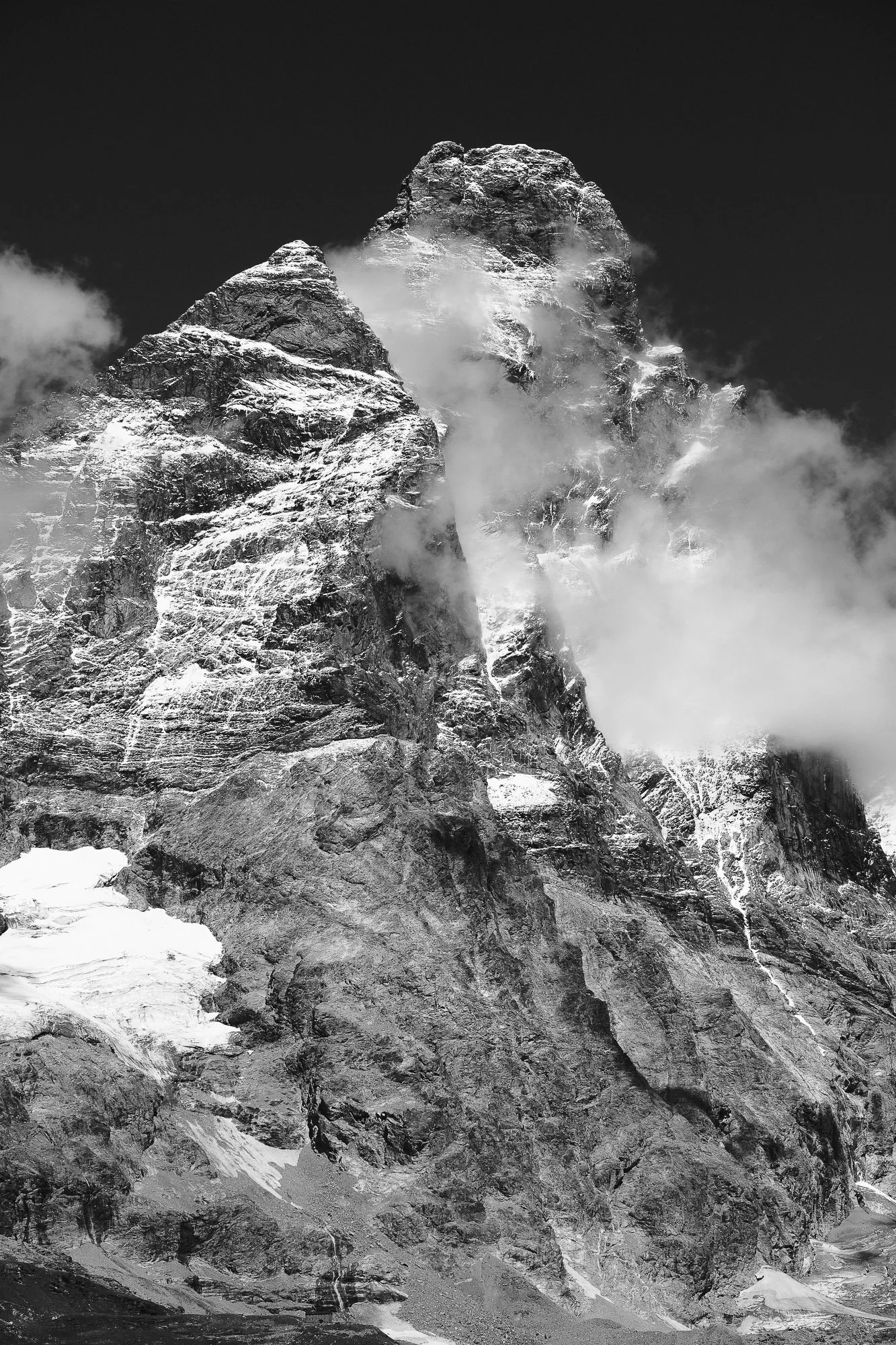

The left hand image is the SOOC example. The JPEG. The original! For those technically minded, it was shot on a Fuji X-T3 using the 55-200mm Zoom (84-305mm full frame equiv). The focal length used was 116mm. Handheld at 1/1000 sec; F8; ISO 200.
But if this (and it is!) is a straight out of camera JPEG, how did you manage to virtually blacken the blue sky whilst still retaining white snow?
Well therein lies the joys of Fujifilm recipes! A while back I came across one developed by Kevin Mullins which he calls “Cysgod” (Welsh for shadow). He writes “a recipe that pushes blacks into silence and lets whites shine like they’re being held up by tension alone. There’s no softness here. No nostalgia. Just contrast, shape, and space. It’s for graphic compositions. Deep silhouettes. Photographs that feel more like etchings than film. The kind of image that doesn’t ask you to feel—it tells you to look.”
Outside of the poetry, the settings are such that Highlight +4 and Shadow +4 exaggerate the tension and flatten greys into bold zones of black and white.
I could have shared this unedited JPEG easily - in fact I did on Instagram Stories which last only 24 hours so there’s nothing there for the record! But when I got back home I felt that this was an image that could be further enhanced by some tweaks and split-toning - same Hue as above (a cool 221 for Shadows / Midtones and warm 42 for Highlights). Hence the right hand of the images above.
Another set of examples of Straight out of Camera JPEG using the same “Cysgod” recipe; Split-Toned and a “yesteryear” colour variant - all of the same shot. Click on any to enlarge.


Which do you like most? After all, how we interpret any scene in front of us is what gives photography such an amazing bandwidth of artistic expression. Are we trying to emphasise the grandeur, the shadows and lines, or the colour context?
I think you know which one I go for ;)