Visual Clarity (1)
Of all the tools and tweaks you get on photo editing software, whether it be Lightroom, Capture One or Snapseed (ok Snapseed calls it something different), Clarity has to be one of the most divisive ones out there in terms of opinion, methods and applicability.
YouTubers, photographers and digital creators out there all offer a wide range of opinions on this particular tool. A film title about good, bad and ugly comes to mind…
Aside from photo editing tools - what do we mean when we talk of clarity?
Both Cambridge and Webster concur on this: -
✅ the quality of being clear - such as the quality of being easily understood
as well as
✅ the state of having a full, detailed, and orderly mental grasp of something
Probably not too much of a surprise there. However in terms of image clarity, what are we saying?
Clarity sometimes gets confused with Sharpening and Contrast as this is what (visually) the Clarity tool does to your image when applied. It gives the impression that you're sharpening your image… in a way it is. It also gives the illusion that contrast is being bumped too.
Without doing a real deep technical dive as to what actually happens your image when applying the tool, it’s good to know that when it comes to Clarity it's not being applied to the entire tonal range. Instead, it's focusing only on the mid-tones of your image. This then gives an appearance of sharpening because it's adding that contrast along the edges of the tones.
It’s the mere name of the photo editing tool, Clarity, as well as how it works, that has so many real world applications for us in these times, that I thought it useful to interrogate the word, the photo-editing application and how we visually see the world around us.
We all frame what’s happening in the world news through particular lenses that we have acquired - our political outlook, our religion, our philosophies and those influencers that we allow to sway our minds.
Is it just me, or are there others - you even - that seek (yes that word gain) Clarity in the chaos? Sharpening the mid-tones? Bringing Contrast to the all the differing opinions, voices and noise?
There will always be people, parties and positions on either edge. Right, Left, Republican, Democrat, Conservative, Labour…
What about those that inhabit the middle?
The peacemakers?
The pray-ers?
The powerless?
How can we apply clarity to help bring definition (Snapseed's word btw.!) in how we visualise things?
The Clarity tool works both ways. Increasing Clarity brings an appearance of sharpness and contrast. Decreasing it brings blur and softness. Sometimes an image “asks” for a reduction in Clarity. Think of a landscape scene through early morning mist. Most times we want a soft “feel” to this photo.
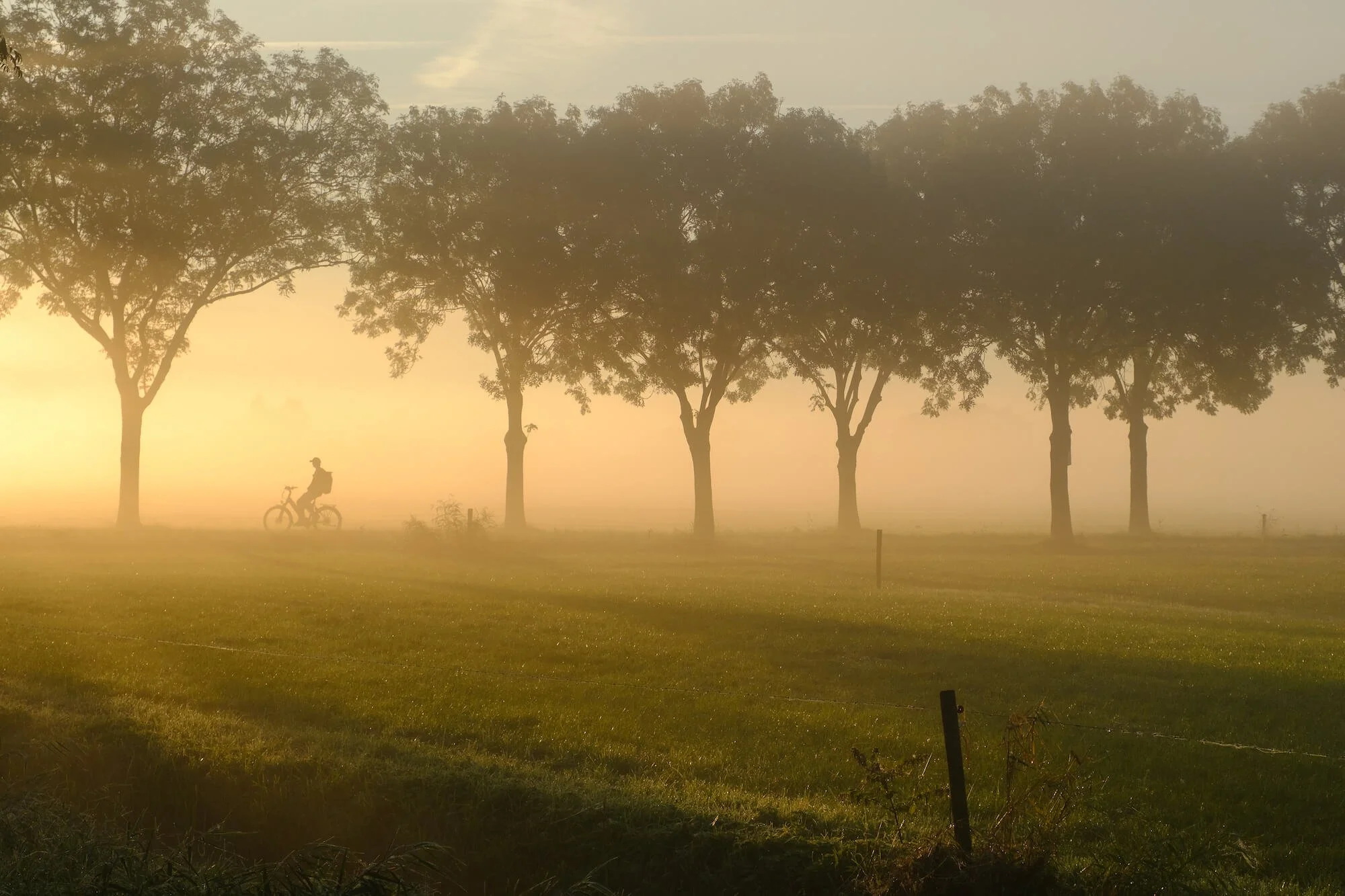
No Clarity applied…!
It can suit us as well to have a softness and blur in our outlook. It can avoid confrontation, argument and clear cut lines which can otherwise appear to others that we have hard edges, and no grey areas in our perspectives.
Finally - when our mid-tones or middle views have been clarified, how do we communicate all the complexities with visual clarity so that others will understand what we're about?
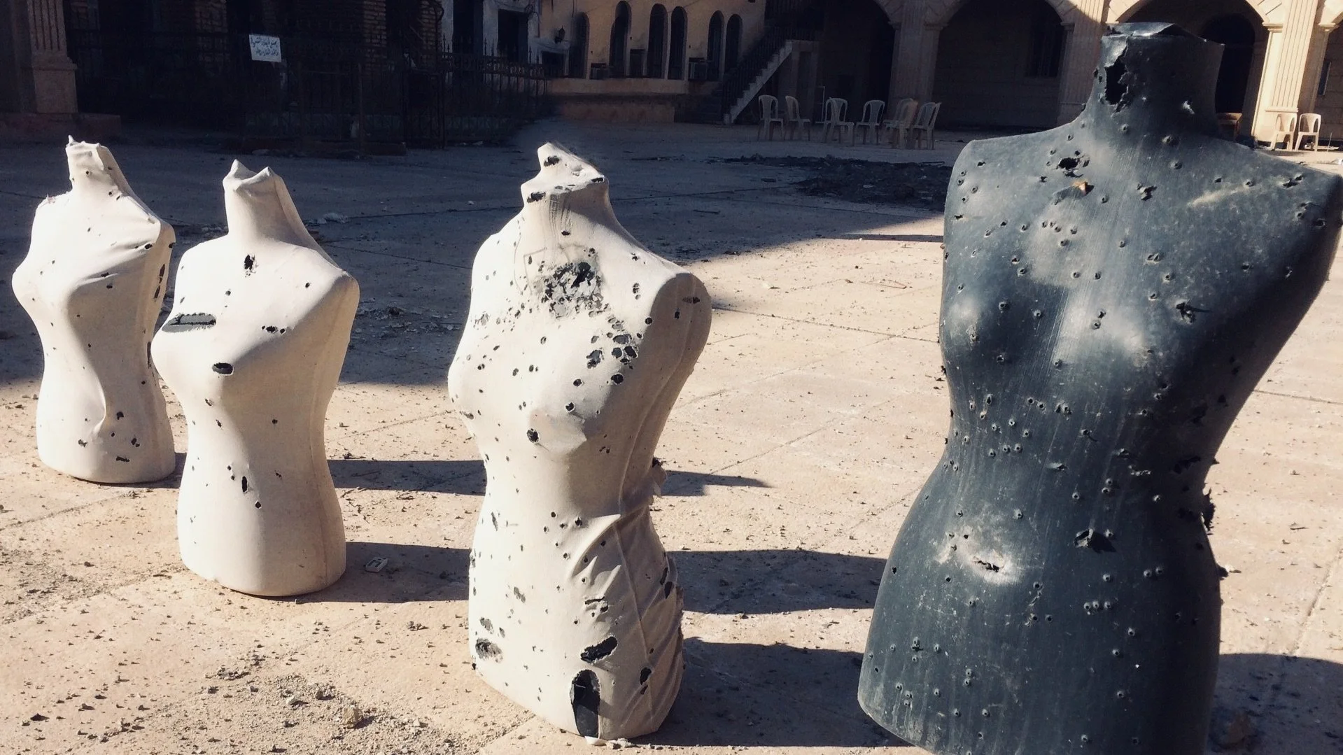
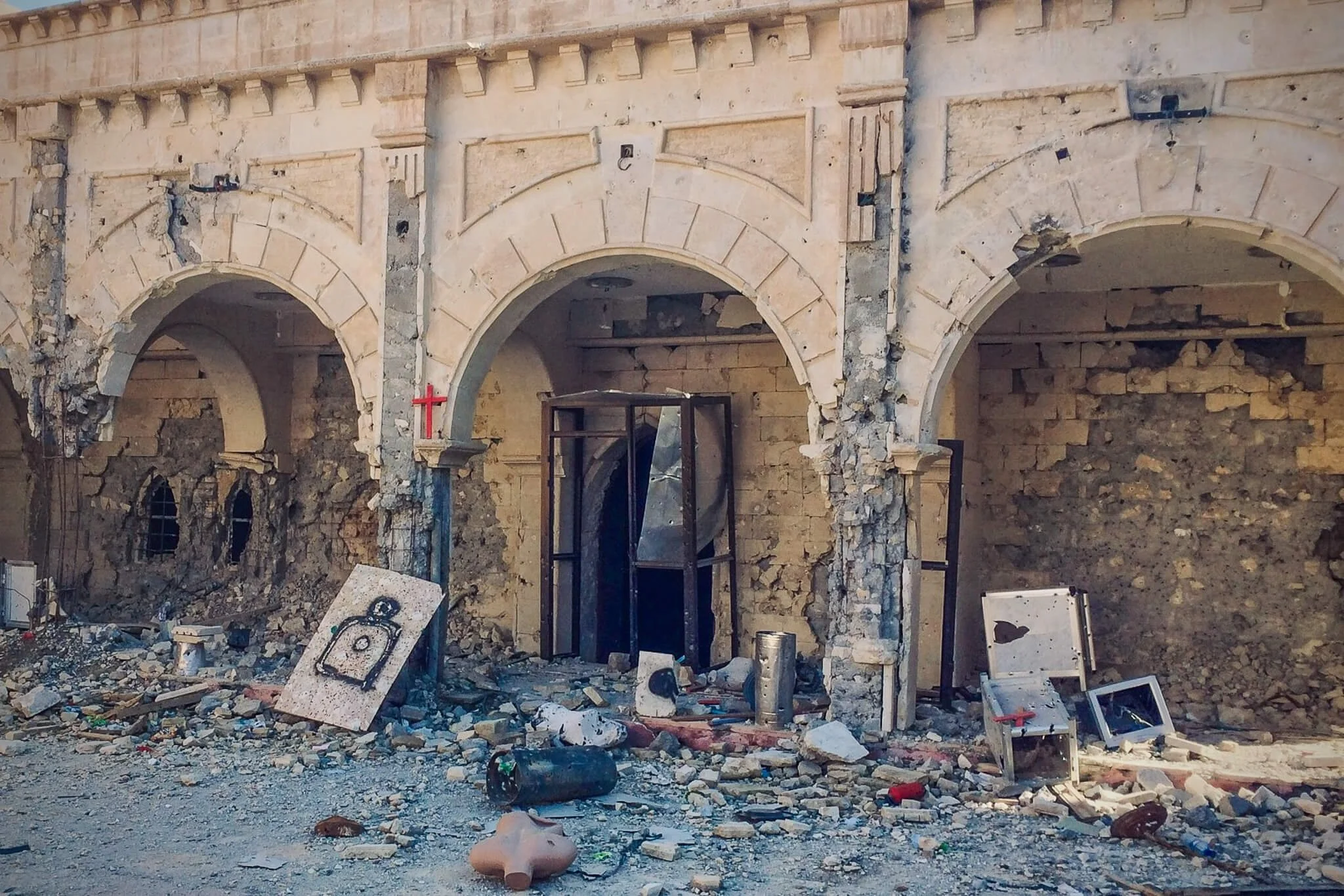
Mannequins used as practice by ISIS in Iraq 2016
Here the goal isn’t to simplify complex problems, but to make them clearer without losing their depth. Communicating complex ideas effectively isn’t about making things look good. It’s about making sure they’re understood.
However we bring definition, context and “sharpness” to our views of war, conflict and suffering, given this is a photography website(!) how can we - with clarity - communicate complexities through our images?
Thanks for reading. More next time…