Not even 30 Shades of Grey
Rather Split-Tone Black & White!
You think I’ve done a typo in the heading? Close but no cigar!
Depending on which website you read, the human eye can “only” see either 30 or 500 shades of grey. So definitely not 50! Quite a difference between these two figures and I’m sure that doing a really deep dive into some scientific journal will tell you the real truth.
However in terms of shades of grey, I’m not sure how many a typical dreary Dutch winter day has but 500 seems a bit over the top. Even 30 does.
They say Ireland has 40 shades of green although I think in all my years living there before moving overseas, the colours I most associate Irish countryside with, are green and grey. Maybe 40 green and 30 grey…
Now what really gets to me living in the Netherlands is the monotonous low blanket grey that can hang over the country for days and days. I think the actual record is 10 straight days without so much as a peek of sunshine.
From outside Amsterdam Central Station - how many shades of grey are there…?
Looking outside from the relative “warmth” of Amsterdam Central
There are probably two approaches - actually maybe three - you can take with these type of days.
Take a long drive southwards. My partner might have something to say…
Light a fire, get a good book and just forget life outside. Not viable with a dog!
OR - get out there and see what you can make with it - photographically that is. Embrace the reality and not your wishes (telling myself over my second coffee of the day looking out the window…)
Capture images with atmosphere. Feeling. Mood.
Having some grain usually helps with all this, certainly in B&W terms, so I decided to go into Amsterdam - where it was forecast to be particularly low cloud 🫣 - with my Fujifilm X-T3 all set up to shoot images on a Tri-X Push-Process Film Simulation Recipe.
Slight deviation with some history follows…
Kodak Tri-X is a B&W film that first saw the light of day back in the 1940’s and was one that I remember my father using quite a bit. (Says something about dull Irish days as well!) Tri-X was rated at 400 ISO (ASA) but could be “pushed” to 800, even 1600 with pretty good results - and of course having some grain.
Given the plethora of Fujifilm recipes now being created for the digital era, it is of no surprise that a digital simulation of the Tri-X film came around. I’ve written quite a bit in earlier posts about Fujifilm recipes so I won’t repeat myself here. Despite newcomers to the game, I always go to Ritchie Roesch to see his recipe details. However searching for his Tri-X push recipe, he actually refers to a recipe devised by Luis Costa.
For the ease of clicking even more links, I’m copying here what Ritchie puts on his page:
Acros (Acros+Y, Acros+R, Acros+G)
Dynamic Range: DR200
Highlight: +3
Shadow: +4
Noise Reduction: -4
Sharpening: -1
Grain Effect: Off
ISO: Auto between 3200 & 12800
Exposure Compensation: +1/3 to +2/3 (typically)
To force the camera to use a high ISO, shoot on at least 1/500 even in low (Dutch fog) weather!
Now even with a grainy film, in ultra flat grey light, there’s a limit to how impactful you can make cityscape images!
SO - enter Split-Tone. I’ve written extensively on this in earlier posts so won’t detail this again. If you are interested in the background of Split-toning and what it’s all about, then posts like this, or a more recent RAW, JPEG, SOOC or something in between… will help you.
All that said, here are some of the images from a freezing grey day in Amsterdam, in the order in which they were taken. Many - but not all - with split-tone applied.
I also took the opportunity to crop a few images into the 65:24 XPan format. These images you can enlarge by clicking on them.
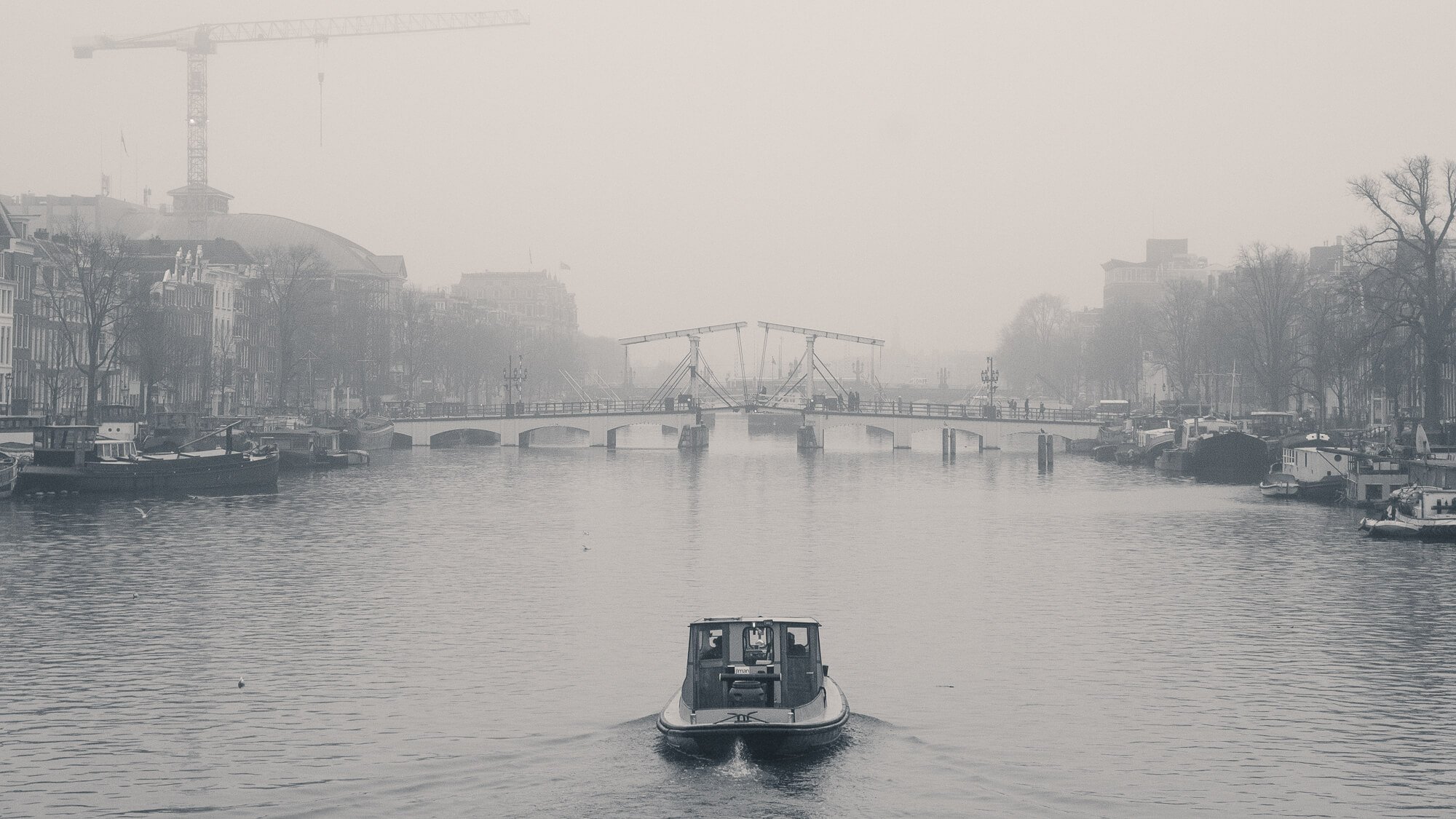
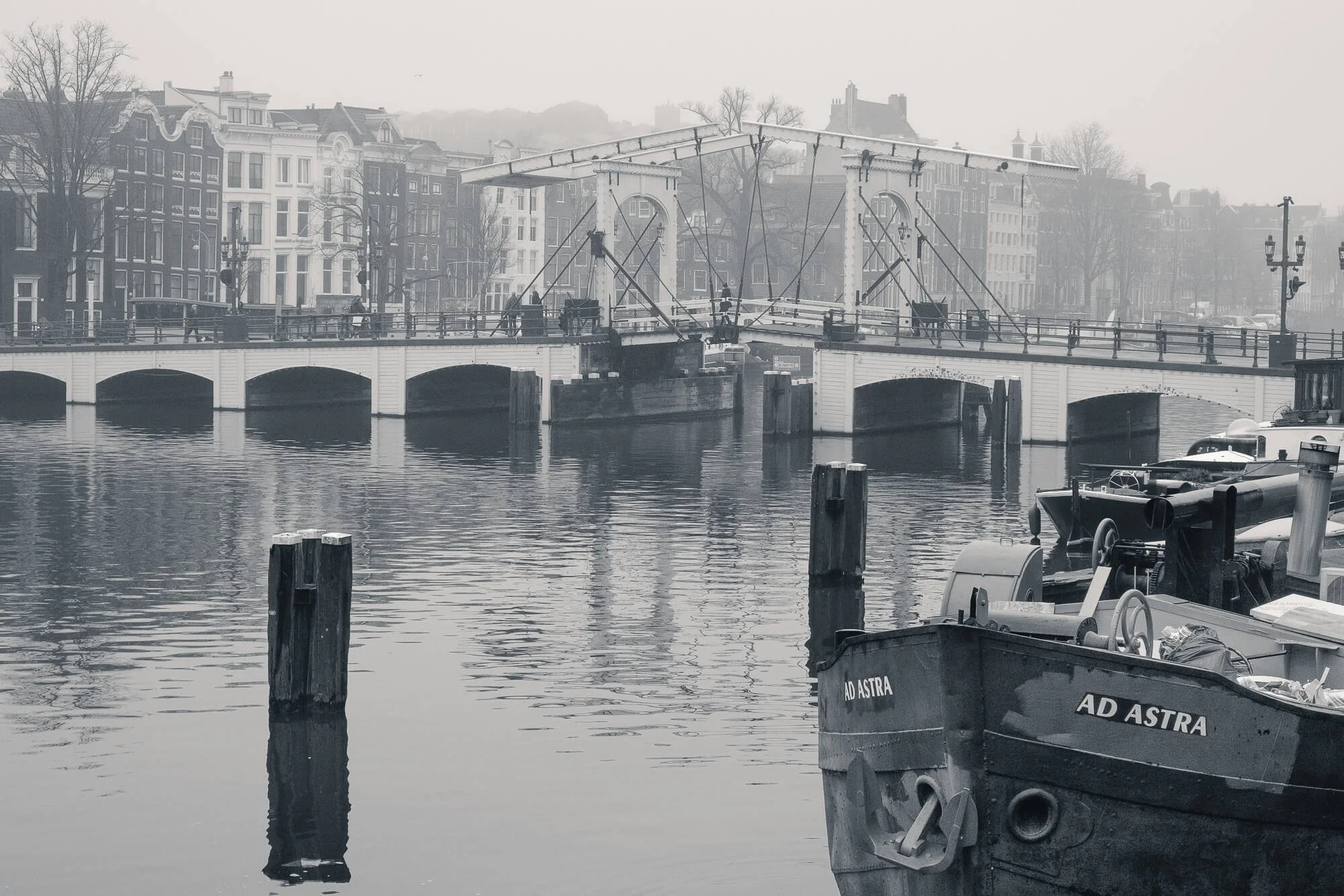
Looking along the Amstel river towards the Magere Brug. Split-tone applied.
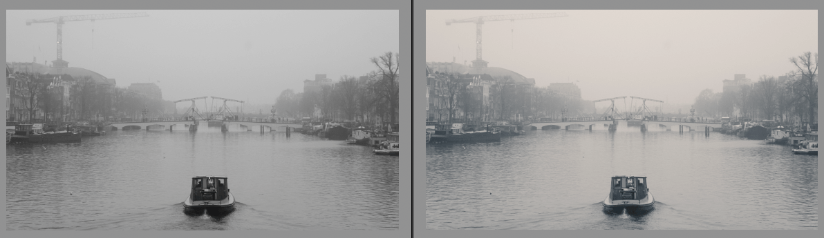
Before and after applying Split-Tone (Left is original RAW)
Looking across the Amstel river from the Walter Suskindbrug into the Herengracht. I didn’t feel a need to split-tone here given the dynamic range in the image itself.
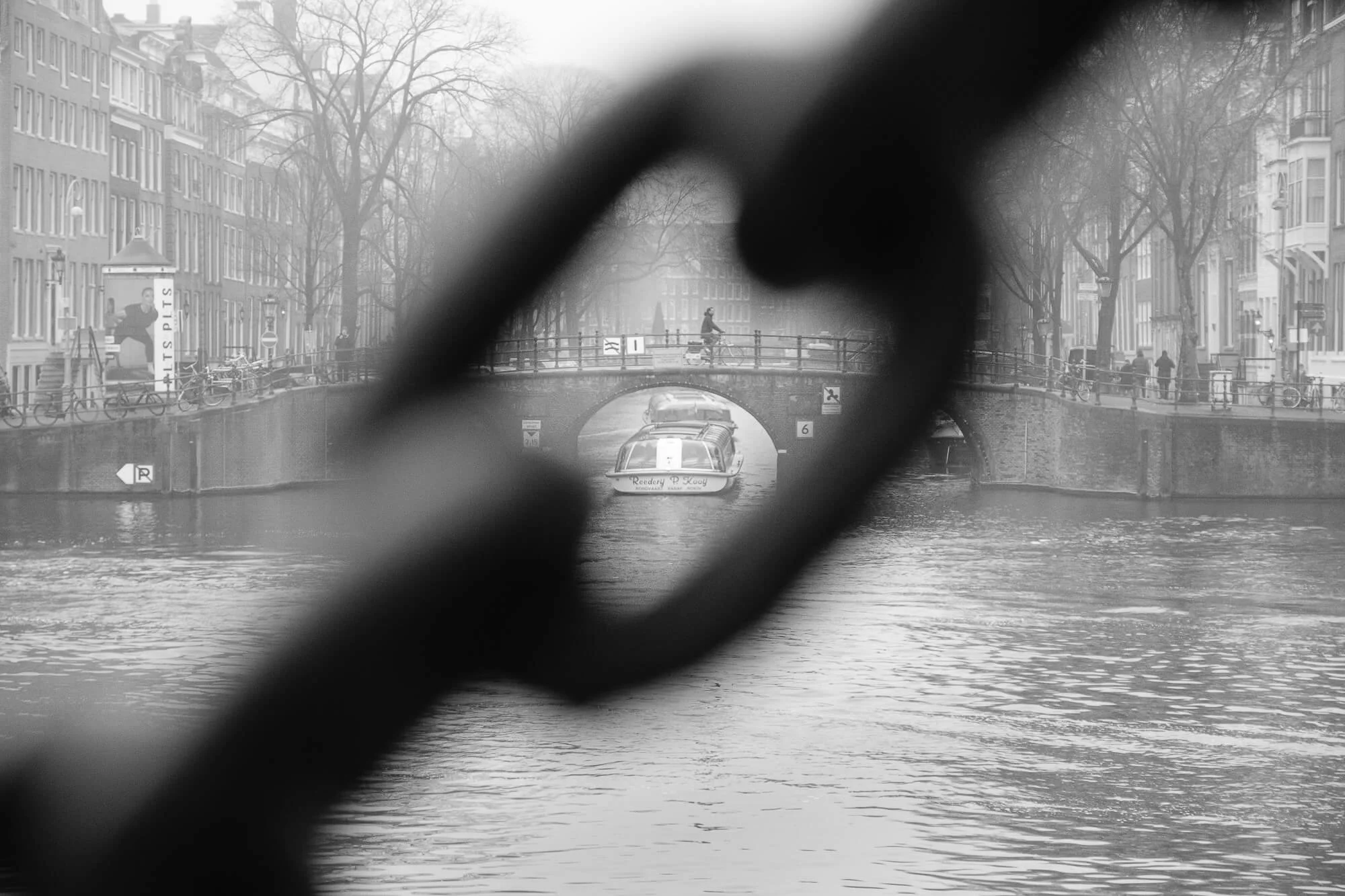
Looking across the Amstel river into the Keizersgracht. Split-tone applied.
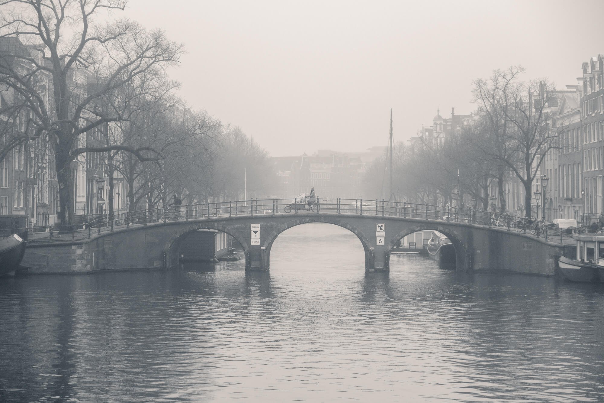
The Magere Brug. Split-tone applied.
The Amstel River. Split-tone applied. Cropped to 65×24 XPan format. Click to enlarge.
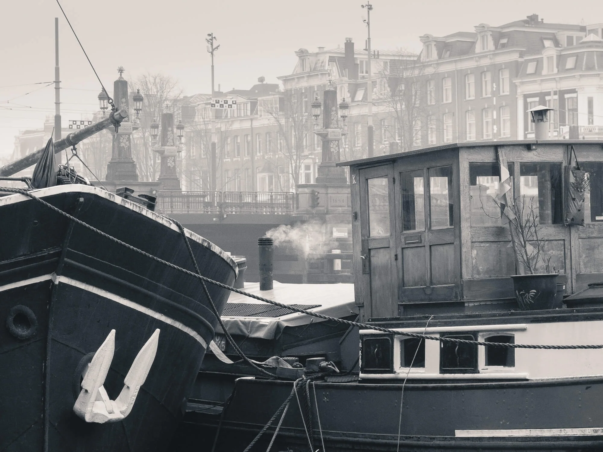
Keeping the fire lit. Amstel River. Split-tone applied.
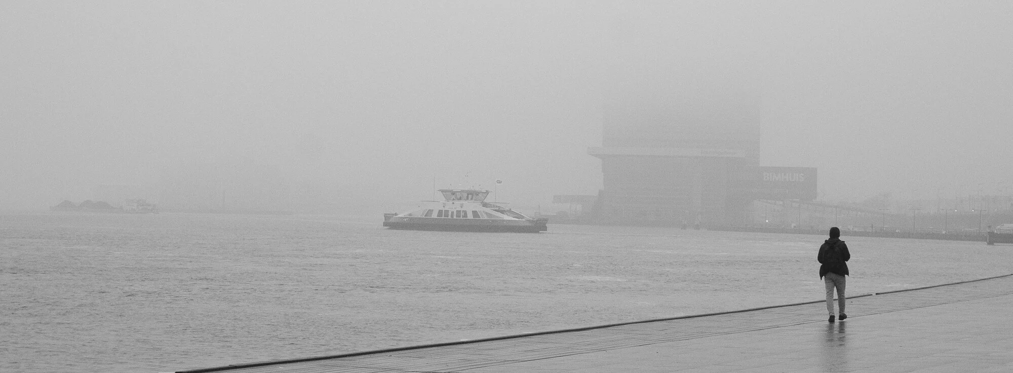
Along the IJ. Split-tone applied. Cropped to 65×24 XPan format. Click to enlarge.
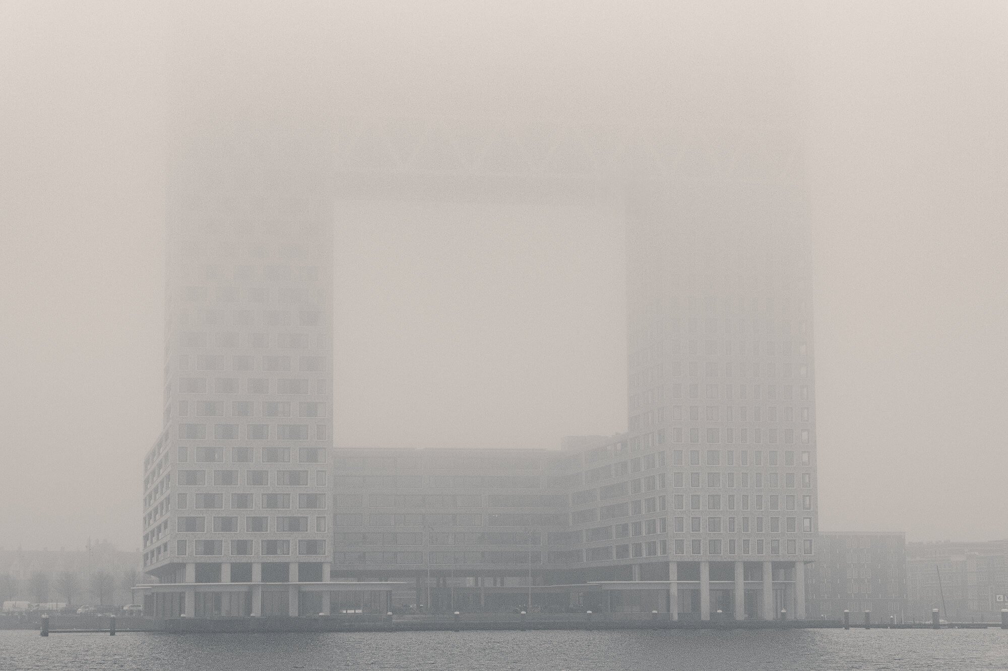
Pontsteiger, Amsterdam. Split-tone applied.
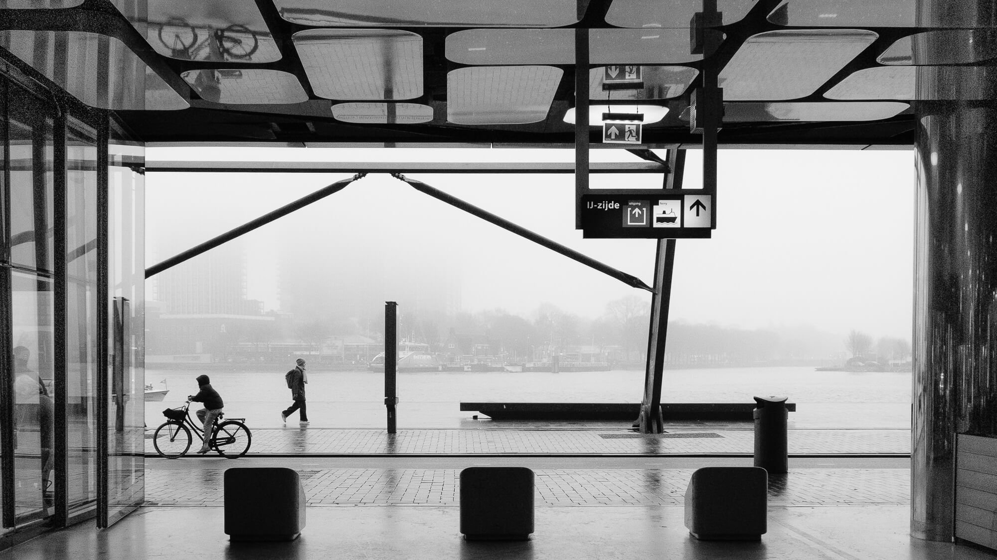
Amsterdam Central from the IJ. Split-tone applied. Cropped to 65×24 XPan format. Click to enlarge.
Oh - and by the way - it’s grey, not gray!
Thanks for reading - and until the next time - stay creative and embrace the realities!